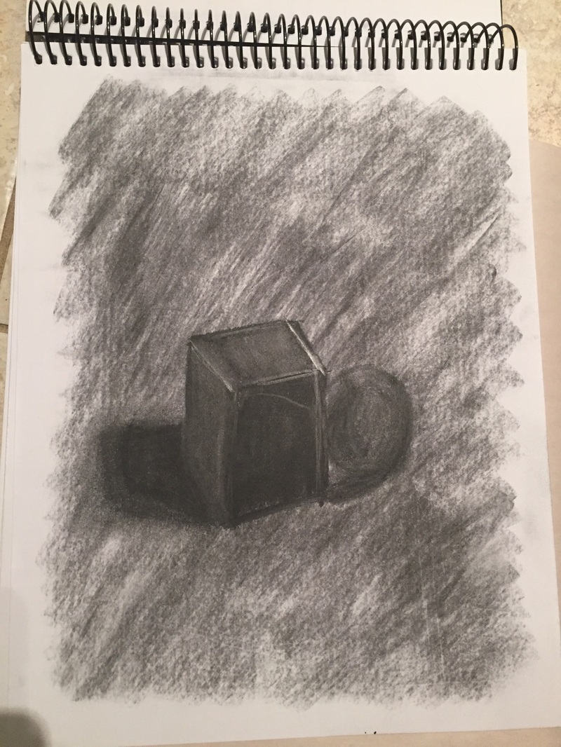
For this mini project, we were told to add a mid value layer to our papers first, then add and remove value accordingly to achieve a more rich look. This piece was done entirely in charcoal, which made working a little bit harder and a little more rough around the edges. The most valuable thing I learned from this exercise was not to look at the color of the shape alone to determine my shading, but to really examine how the light was hitting the figure. At first I colored the block all the same color, but upon closer inspection, realized there was more variation in the surface than I had first perceived. I think going back to erase some of the charcoal added more depth and reality to the piece.
 RSS Feed
