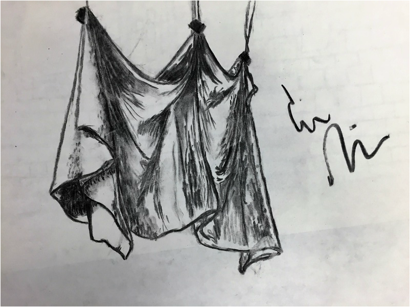
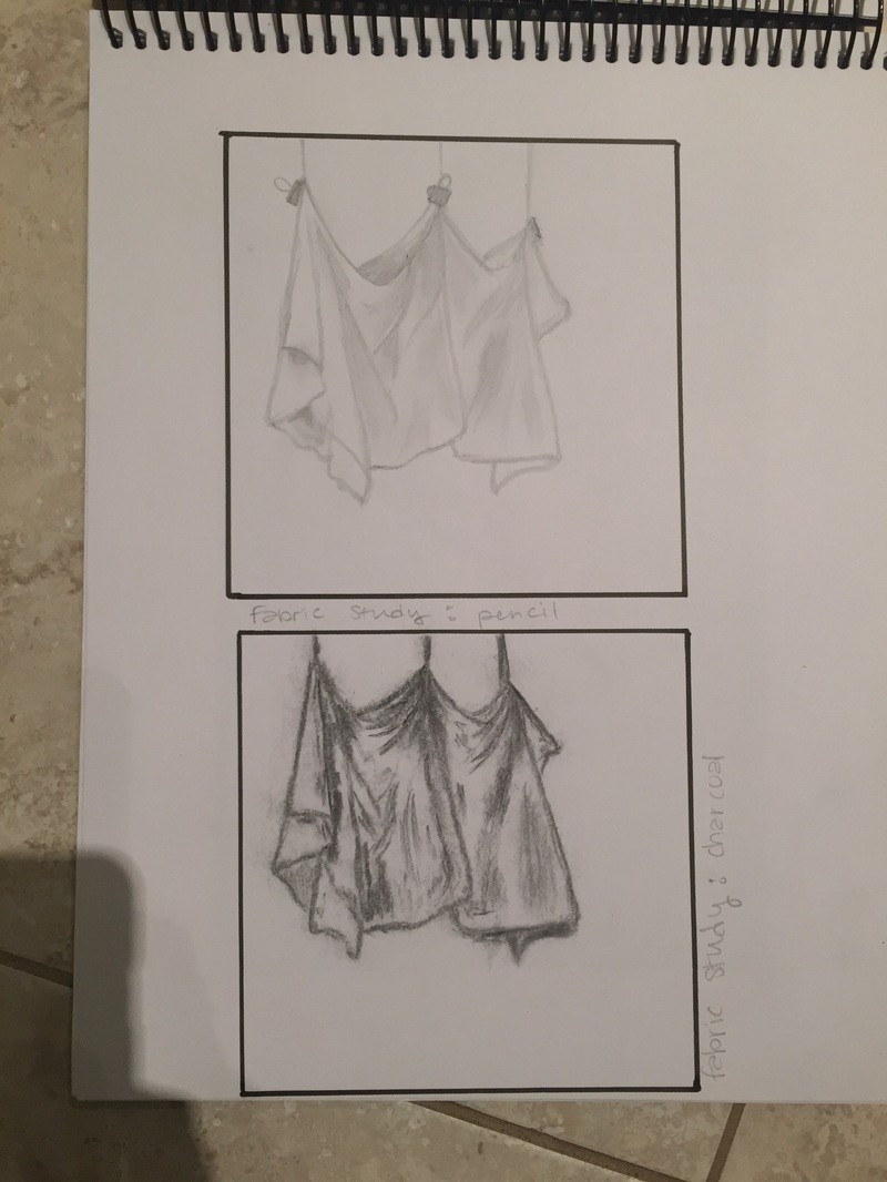
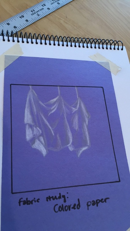
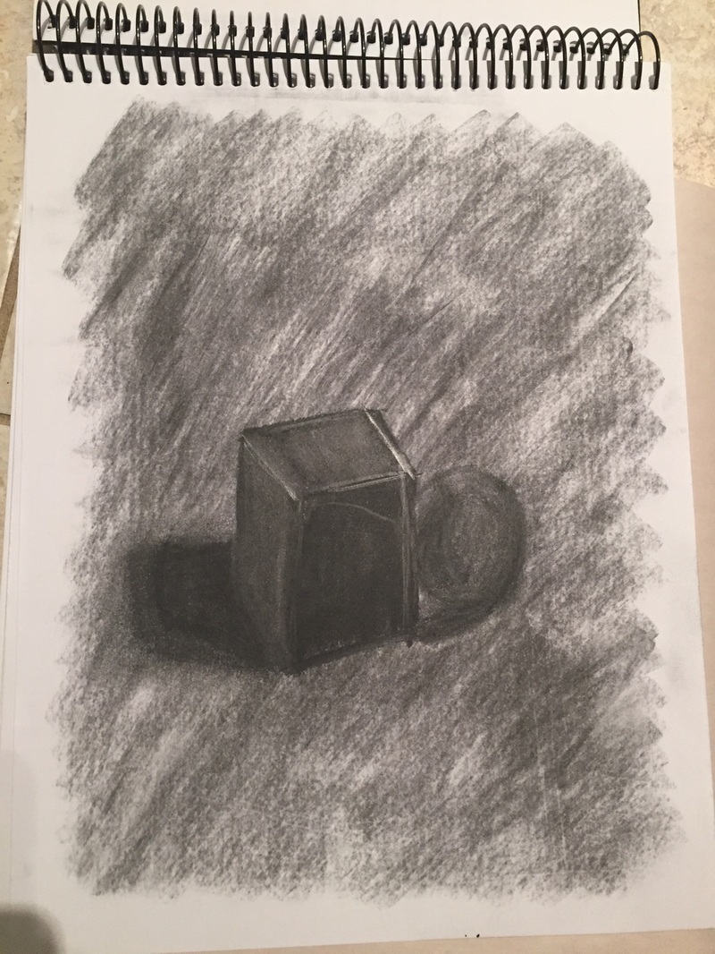
For this piece, I used a wide range of values and showed that I am definitely not afraid of the dark. This is evident through all of the different charcoal strokes in the fabric, which have varying lengths and intensities. When you look at the piece, the folds and shadows are implied by the different shades of gray I added. The practice studies I did were extremely crucial to my understanding of value in this piece, especially since I did the same perspective for my studies as I did for my final. By the time I got to the final piece, I already knew where all the folds and drapes were in the fabric, so the values flowed more naturally from me. My prior knowledge of value helped me articulate where and when I should blend the values out into lighter shades in order to convey the form I wanted. In regards to the blending technique itself, I just went for it. I've never attempted a serious piece in charcoal before, so I knew I wouldn't have the control yet to make it really photo realistic. Instead of trying to make my piece smooth, I embraced a more spontaneous and stroke-based style to achieve my blending. The transitions are rough and sketchy, but I think they were still successful because of how many lines and dots I added. Most of the time I applied medium pressure to the charcoal, though there were a couple of places where I really laid into it and others where I went super light. My interpretation of texture in this piece was very line-based, and I feel that helped capture the texture of the piece because the fabric itself had an infinite number of tiny crease lines in it. If I could do this project again, I would push myself to make the piece even bigger so I could get even more detail captured.
As someone who wants to major in fashion, it was extremely pleasing to me to finally get to work with drawing fabric. Drawing fabric was never something I was awesome at, but is obviously a skill I will need for college. Though I thought I was going to hate trying to capture every fold and shadow, I actually loved these studies a lot. The biggest lesson I learned here was just to let go and have fun with it. I found that the more I relaxed into the drawing and focused on one section at a time, the better results I got. Given the scale of these studies, I couldn't get an incredible amount of detail in the frame, but I liked giving my impressionistic view of the folds.
This exercise was a challenge for me, as I have never really worked with Prismas on colored paper before. The hardest part, in my opinion, was making the depth of the curls in the paper believable. Paying close attention to where the shadows and really bright highlights were in the piece was crucial. I think the one on the bottom was my best work because I took the most care in observation for that one, along with placing the highlights exactly where I saw them. I loved blending the white and gray pencils, I think the gray midtones helped lessen the contrast between the paper and the white Prisma, which made the surface more realistic.
For this mini project, we were told to add a mid value layer to our papers first, then add and remove value accordingly to achieve a more rich look. This piece was done entirely in charcoal, which made working a little bit harder and a little more rough around the edges. The most valuable thing I learned from this exercise was not to look at the color of the shape alone to determine my shading, but to really examine how the light was hitting the figure. At first I colored the block all the same color, but upon closer inspection, realized there was more variation in the surface than I had first perceived. I think going back to erase some of the charcoal added more depth and reality to the piece.
For these pieces, I did use a fluid line. Though the majority of the lines in the art are darkened by multiple passes, there are textures in the piece that were created by a visibly curvy and connected line. There are also spots where I lightly trailed over the paper to get from one spot to another without lifting the pen. Creating multiple practice pieces was absolutely crucial to the success of my piece. They allowed me to familiarize myself with the pen and learn what things I did wrong so I would spend more time focusing on them in the real deal. My previous art knowledge gained from Art I was also helpful in being able to understand how to accurately execute what I saw around me. The major difference between my contour drawing and an outline drawing, I think, is just the crispness of the lines. Had I done this piece as an outline, there wouldn't be nearly as many lines and the texture I added would not be included. The piece would have looked a lot more empty and not as interesting. The irregularities in the lines makes the piece more unique. I interpret lines to be barriers between things that are solid and the empty space between them. I feel I have a heavy-handed drawing style, so I tend to prefer to draw things with bold lines. When drawing this room, I made the lines thicker on things with heavier materials and thinner on things that were a little more finely-detailed. This technique helped me capture the look of the room by allowing the viewer to notice that not everything in the room was made of the same material; some things were made of metal, while others were made of fabric. Completing this drawing taught me a lot about the importance of angles and proper spacing. If these things are neglected, the perspective of the drawing shifts and warps away from what you are actually observing. I also learned how to fill a piece of paper as large as the one I used, which was something I had never done before. If I could do this piece again, I would first consider the piece as a whole to determine where things should be placed on the paper. By just rushing in, I ended up messing up the proportions and overlapping objects in the room that weren't supposed to be overlapped. I would also take more time ensuring that my angles were as close to what I saw as possible.
The first thing we did in drawing class was contour art. The first one was without looking at the paper, and the other two were looking at the paper and the subject. Contour lines are continuous lines, so for these drawings we were not allowed to lift the pen. I have never really done observational drawing from life, and I certainly have never attempted a contour drawing before this class. I think contour lines allowed me accept my mistakes and incorporate them into the piece.
|
AuthorWrite something about yourself. No need to be fancy, just an overview. Archives
May 2016
Categories |