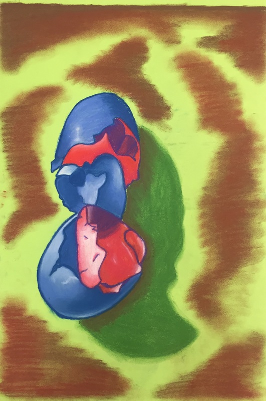
This mini project was focused more on getting us familiar with chalk pastels and how to blend them together. The idea was to use an arrangement of eggs on a table and shade them according to the dramatic lighting we created. Instead of doing the typical arrangement, I decided to draw two eggs cracked and nested inside of each other because I liked that composition better. Capturing the perspective and details was hard to do, but the end result looks solid to me. I wish I had taken a step back from the piece while it was in progress so I could have seen how oddly the bottom pink section is shaped, as I would have rounded it out more. I'm incredibly proud of the blending, especially in the bottom half of the blue egg. If I were to do this again, I would try to find a way to make the table look more convincing.
This mini project was geared towards helping us figure out how to convey opacity and transparency using chalk pastel. Though again my style went more graphic than realistic, I think I succeeded in making the candies look as though they were wrapped in plastic. I have to say, now that I have the piece on a computer screen, I really love how vibrant it is. I hadn't noticed before just how much white I used. If i were to do this again, I would have made sure that the line of candies was straight and I might have put them at an angle to make them more interesting. I also would have tried to make the folds in the wrapper more angular and distinctive to make the piece more realistic.
For the Dum-Dum project, I decided to invert the colors of the piece to see what it what look like. In the end, I wish I had kept the original colors because I worked with my least favorite color primarily. Because I dodged the wrapper in the progression drawing, I had no clue how to approach making the folds look real for this project. As a result, I feel the piece came across as more graphic than realistic. We were told to add colors to the piece that don't actually exist in order to make the piece more interesting, and I will say that I am very grateful for that advice. The hints of blue and purple make the piece just a little bit less earthy and pay homage more to the original coloration of the wrapper, which I think looks good. Overall, if I could do this project again, well, I would just do it again.
This piece was the first time I really experimented with value and placement of value. The outline of the pear is simple and the surfaces were smooth, so without the value changes there would have been absolutely no texture or interest in the piece. I also feel that the values I used made the piece realistic. My biggest challenge for this piece was drawing the shadows and highlights exactly as they appeared in front of me. Because the pear was so simple a form to draw, I wanted to get every nuance of the shading perfectly captured. Lots of times I had to erase value I had laid on too dark and try again. Sometimes the value changes were so subtle that they were nearly impossible to detect. I overcame this challenge by staying relaxed and focusing as hard as I could to notice every detail. My piece didn't include a wrapper, but I think the lines in the bite marks would have been a lot less striking and definitive had I not made them so crisp and darker than the rest of the fruit. For this piece, I wanted to blend out the values and make them smooth, like the pear itself. Had I not blended them as well and let the pencil strokes show more, the texture would have read as more rough than reality. If I could redo three things about this project, I would entirely redraw the first pear, the left bite mark on the third, and the shadow on the fourth. I learned how to capture shadows and highlights accurately through shape shading with this project, which was a concept I applied to my still life drawing. I also learned to more closely observe objects.
My drawing is composed of very distinct shapes which are shaded using heavy value. I believe I blended the values well despite the fact that I drew the shadows and highlights as shapes first to map them out. The space is very clearly defined, and there isn't any intentional smudging to blur the edges of the objects. The shading on the lunchbox is realistic to me. The shading on the pine cone, elephant, and sock monkey appear to be more graphic to me. I took extra care to be sure I included the widest range of values possible, and I believe I successfully captured all nine. Value, in my opinion, is what makes or breaks a piece. They are so important because they add dimension and texture to otherwise flat drawings. The better the values are, the more realistic the piece. Value can also distinguish a good artist from a great artist. The best artists push their values as much as they can when appropriate. Unfortunately, I would say that my light source is hard to locate right away. Upon closer inspection, you can notice the subtle value changes that indicate a light placed in the upper right corner of the scene. To me, the compositional sketches were not that crucial for this project. I have consistently had problems with scaling things up and down, so making small compositional sketches hindered my accuracy considerably. I found it challenging to even accurately convey what I was seeing. I think the most successful part of my piece is the values. I surprised even myself with how dark I pushed them and with how smooth the transitions were. I also felt that my proportions were the most accurate I have ever made them. Though the perspective shifted from the one in the sketch, it is consistent throughout the entire piece. The proportions are solid and I feel as though the structure of the piece was sound. I found the arrangement of objects of be pleasing because of how closely packed the objects are. My piece doesn't really have a focal point because the eye is drawn around the page constantly to examine different details. The only part of this piece that I felt I spent too much time on was the front face of the lunchbox. That part alone took three and a half class periods. If I were to do this drawing again, I would not have wound myself so tight over every little detail in the print. My biggest challenge was just the time sink of the lunchbox. In addition, the pine cone got completely moved over the weekend. I already had most of the fronds drawn, so instead of erasing them I just added new ones from the new scene into them. For the lunchbox, I just took some deep breaths and listened to my favorite music. Drawing a still life has taught me that perspective and proportions are crucial to making a piece look accurate and realistic. I also learned that I can create realistic, high-value objects.
|
AuthorWrite something about yourself. No need to be fancy, just an overview. Archives
May 2016
Categories |