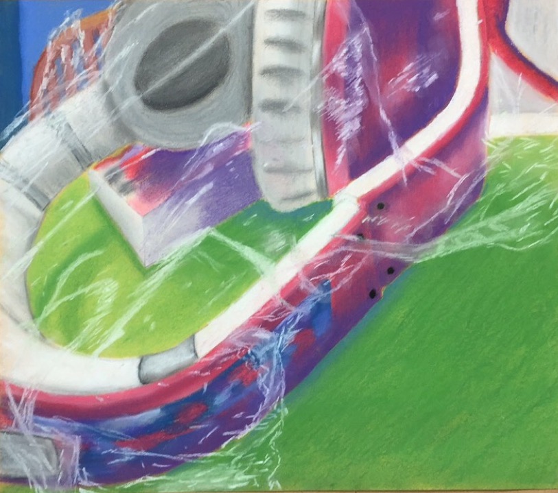
I think my piece is fairly neat. The edges aren't super crisp, but the colors are fairly well contained in their respective areas. I kept the chalk really close to the lines I sketched with the pencil, so I maintained the original image fairly well. The color choices I made for the wall in the background and for the table help unify the art by making the whole image as vibrant as the headphones are. Originally, the wall was a lighter green and the table was yellow, which was also the color I chose for my paper. The new colors add just a little more interest and pop to the piece. All the colors in the piece have a cool undertone, even the brown and green. I think the green for the table made sense with the color of the headphones because they are compliments. I created contrast in my piece by making the shadows very distinct and bold. This makes the transitions between the colors more dramatic and noticeable. The highlights in the piece are equally distinct, and I think they make the light source of the picture easy to locate. Almost everything in the scene had a smooth texture, so the only real texture was the Saran Wrap. I think the wrinkles in the wrap at the bottom of the page enhance the piece because they are the one part where it is most obvious that the headphones are covered with something. If I had made this texture a little more regular and smooth, the effect would not have been as strong. I chose yellow paper for this project because I figured it would give the colors a little bit of a brightness boost and would also add to their vibrancy. I don't think the colors would have been as rich and full had I drawn this on white paper. Understanding chalk pastels and how to use them to achieve the effect I wanted was absolutely crucial to this piece. Thanks to the practice piece we did with it, I was able to play around with the best ways to blend the colors without them getting muddy. Accepting the fact that, in reality, I don't have a ton of control over the pastels was very important to me because it allowed me to embrace the irregularities in the color throughout the piece. The hardest parts of this piece were getting the perspective of the manga book correct and keeping the chalk somewhat under control without smudging it a ton with my hands accidentally. I could definitely improve the Saran Wrap if I did the piece again. I think I would just have to focus more on the minute reflections in the plastic to make it more realistic.
 RSS Feed
