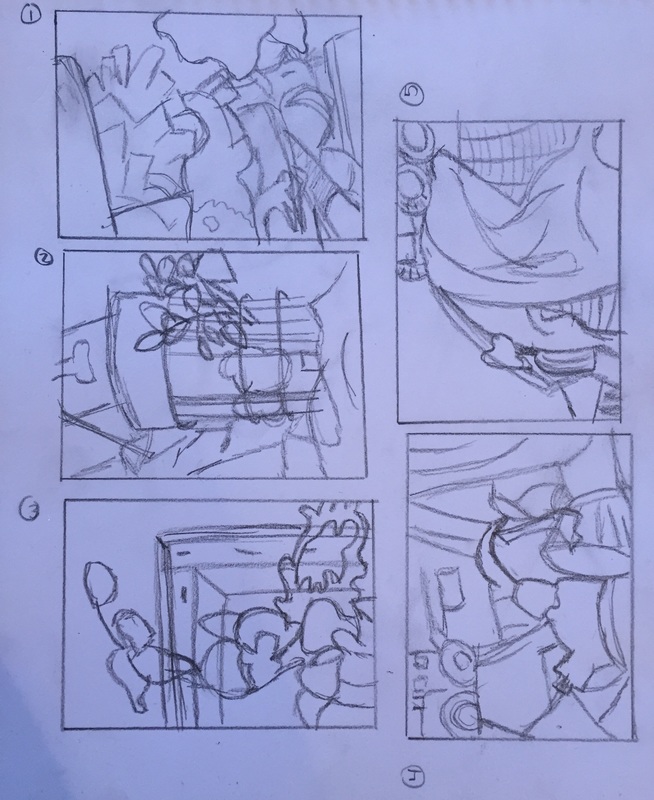
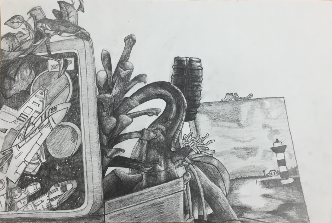
My drawing is composed of very distinct shapes which are shaded using heavy value. I believe I blended the values well despite the fact that I drew the shadows and highlights as shapes first to map them out. The space is very clearly defined, and there isn't any intentional smudging to blur the edges of the objects. The shading on the lunchbox is realistic to me. The shading on the pine cone, elephant, and sock monkey appear to be more graphic to me. I took extra care to be sure I included the widest range of values possible, and I believe I successfully captured all nine. Value, in my opinion, is what makes or breaks a piece. They are so important because they add dimension and texture to otherwise flat drawings. The better the values are, the more realistic the piece. Value can also distinguish a good artist from a great artist. The best artists push their values as much as they can when appropriate. Unfortunately, I would say that my light source is hard to locate right away. Upon closer inspection, you can notice the subtle value changes that indicate a light placed in the upper right corner of the scene. To me, the compositional sketches were not that crucial for this project. I have consistently had problems with scaling things up and down, so making small compositional sketches hindered my accuracy considerably. I found it challenging to even accurately convey what I was seeing. I think the most successful part of my piece is the values. I surprised even myself with how dark I pushed them and with how smooth the transitions were. I also felt that my proportions were the most accurate I have ever made them. Though the perspective shifted from the one in the sketch, it is consistent throughout the entire piece. The proportions are solid and I feel as though the structure of the piece was sound. I found the arrangement of objects of be pleasing because of how closely packed the objects are. My piece doesn't really have a focal point because the eye is drawn around the page constantly to examine different details. The only part of this piece that I felt I spent too much time on was the front face of the lunchbox. That part alone took three and a half class periods. If I were to do this drawing again, I would not have wound myself so tight over every little detail in the print. My biggest challenge was just the time sink of the lunchbox. In addition, the pine cone got completely moved over the weekend. I already had most of the fronds drawn, so instead of erasing them I just added new ones from the new scene into them. For the lunchbox, I just took some deep breaths and listened to my favorite music. Drawing a still life has taught me that perspective and proportions are crucial to making a piece look accurate and realistic. I also learned that I can create realistic, high-value objects.
 RSS Feed
