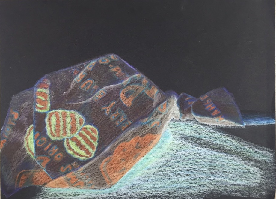
For the Dum-Dum project, I decided to invert the colors of the piece to see what it what look like. In the end, I wish I had kept the original colors because I worked with my least favorite color primarily. Because I dodged the wrapper in the progression drawing, I had no clue how to approach making the folds look real for this project. As a result, I feel the piece came across as more graphic than realistic. We were told to add colors to the piece that don't actually exist in order to make the piece more interesting, and I will say that I am very grateful for that advice. The hints of blue and purple make the piece just a little bit less earthy and pay homage more to the original coloration of the wrapper, which I think looks good. Overall, if I could do this project again, well, I would just do it again.
 RSS Feed
