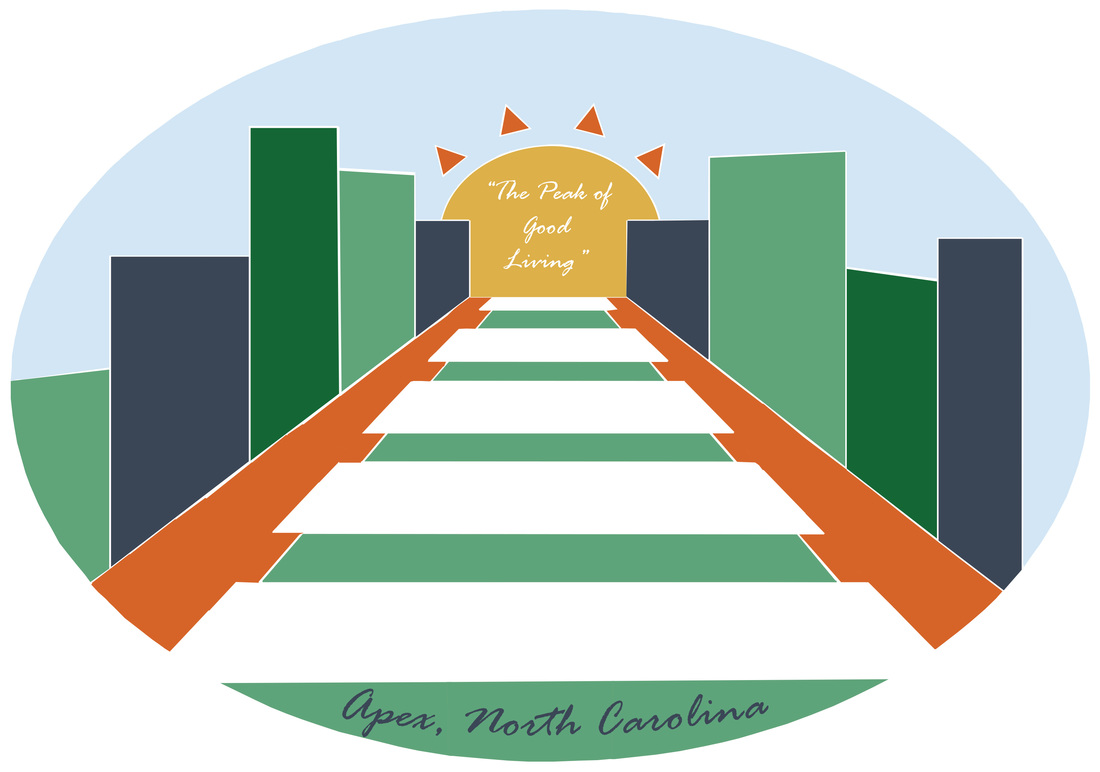
When I was designing this logo, I took into account the fact that the client wanted a less cluttered logo that was easier on the eye and easier to interpret. Keeping in find the fact that Apex was a town built around the railroad system, I made sure to incorporate railroad ties in to the design. One of the best features of the town is our downtown area, and I wanted to include that as well. I considered adding windows to the buildings, but decided against it because I felt it would clutter the design. If I could do this project again, I would have made the design more interesting and progressive. I also would have been a little more careful with how I filled in the shapes.
 RSS Feed
