|
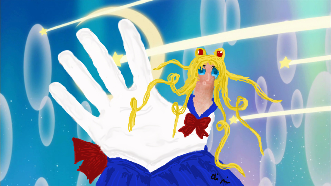
For this project, we had to use Tinkercad to design our own original 3D piece. I chose to make mine a necklace for one of my favorite kpop groups, EXO. At first Tinkercad was incredibly frustrating to work with, but after a couple of days I got acclimated to the controls. Because the design wasn't too complicated, the project really came down to positioning the shapes where I wanted them to be. Watching the 3D printer was fascinating, and I find it really incredible that something I designed on a computer is now a physical object. Overall, I am happy with the product I created and would do it all again. 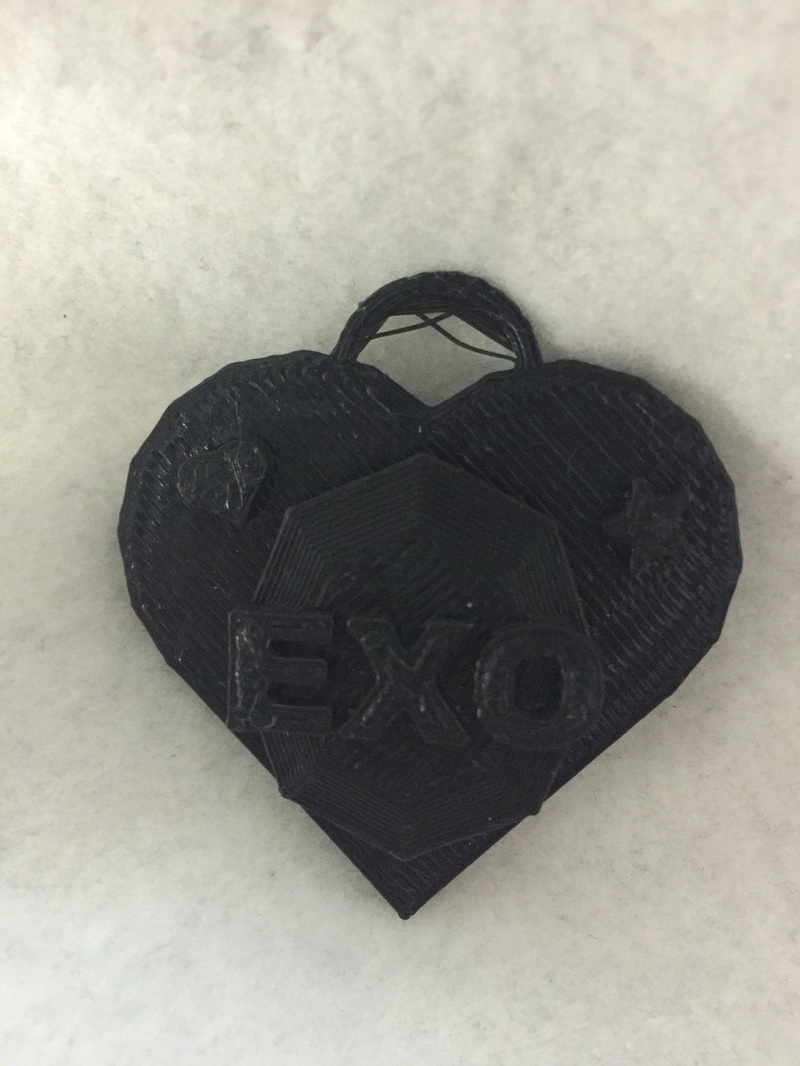 For this project, I took Halsey and Sailor Moon and morphed them together. I chose these two because I really love Halsey's appearance and I have always been captivated by the artistry and proportions for Sailor Moon. Though these body proportions and characteristics are obviously unattainable, I do believe that there is some pressure in the media for girls to look a certain way. Almost every model depicted in ads and runways is rail thin, and the "plus size" models are just normal people. This tells girls that in order to be beautiful, they need to be skinny, often much skinnier than is healthy for their bodies. Makeup is applied on even child models, and girls are always depicted as super feminine. Legs must be smooth, hair must be perfect. Even men face stigmas, such as a perfectly-muscled body and ultra-masculine fashions. 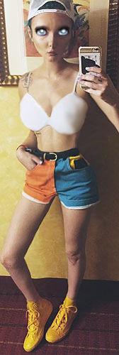 I decided to do the project again so I could follow the prompt more closely. I chose a few different dessert items for the same reason as I did on the last piece. This project really isn't that hard, just very tedious! 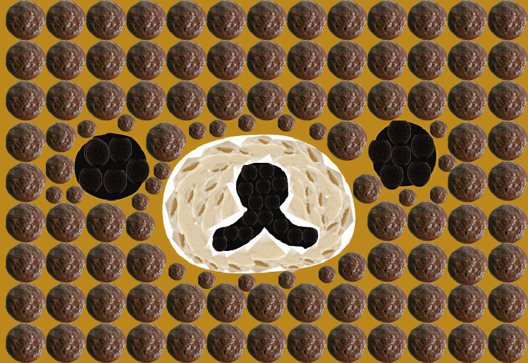 For this project, I chose to use Brown Bear and Cony Bunny plushes because I have had a lot of interest in them as of late. Instead of them just being ordinary stuffed animals, they are now completely edible! My theme for this piece was cute desserts, just to add some character and keep it kawaii. I included ice cream, black licorice chews, a cookie, and Starbursts. For me, I think the most difficult part for me was controlling the clone stamp and making the textures look neat and believable. If I could do this project again, I would probably spend more time cleaning up the edges and would paint on a different layer (the ice cream texture was applied directly to the background on accident). 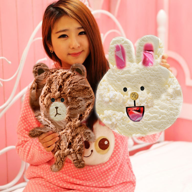 For this project I used the same G-Dragon face I used for my kPop label. I chose this image because the head shot was so straight on that it made selecting and isolating his facial features easy. I have always loved Andy Warhol's art, so I wanted to pay homage to him through this piece. I wanted to be a little bold with my color choices and put paint in places that weren't necessarily expected. If I could do this project again, I would have found a different tutorial to watch because the one I used really confused me! 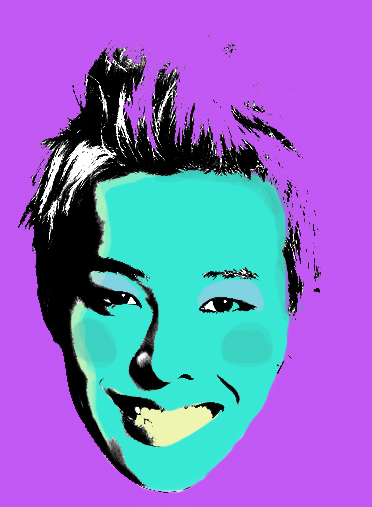 This week we had a the theme transparent. I have always loved surreal photography, so I decided to create some of my own! I intended to erase my body and have the background be visible instead, but realized once I was at school that I didn't have a blank background to work with. Instead, I decided to mess around with the blur and smudge tools. As you can tell, the two photos were handled with a slightly different technique. In the first one, I blurred, smudged, and erased my exposed body to create a sort of black ghost form. After all of that, I also added a motion blur filter on top of the whole photo so the transitions would be more believable. I started the second photo intending to make it exactly like the first, but then ended up really loving having my body just blurred. I like how the second picture looks blatantly fake, I think that add to the creepy feel. If I had the chance to do this project again, I would have stuck to the original plan and made sure to take a back ground picture. 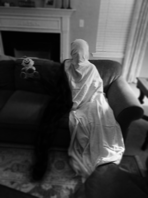 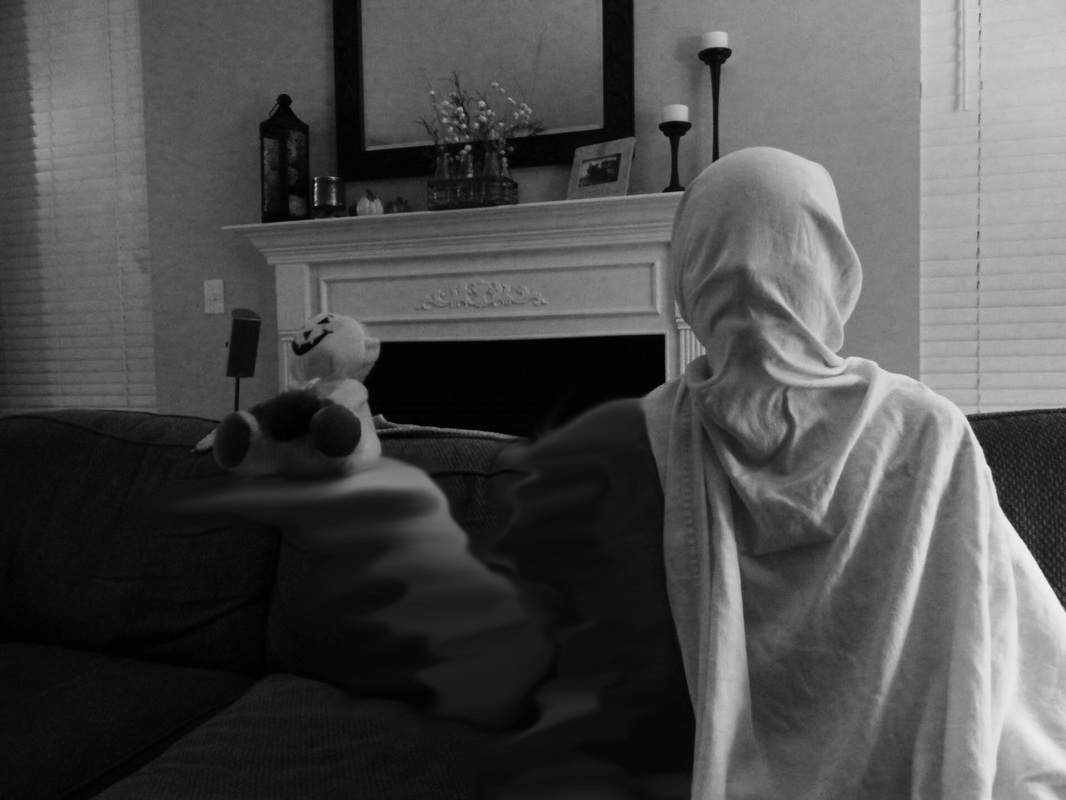 As a hardcore pasta lover, I decided to base my village off of pasta sauce ingredients. I could see chipmunks living here because they are small and very cute. The fantastical colors would accentuate the cutsie feel, which I really wanted. I also have a love for warped perceptions of reality, so that is why I made everything but the tomato colors that could not feasibly occur in nature in that context. I wanted to blend the edges of the doors and ingredients to make them look less applied, but I couldn't get the eraser to look how I wanted. I just figured I would let the piece be what it was without the blending because I still think it looks good. Also I think more experience with the warp tool and a better understanding of the curves of my objects would have helped me more accurately form the doors to the garlic and tomato.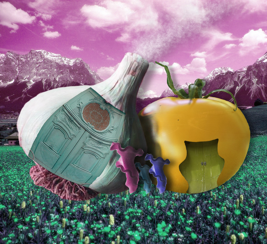 |
AuthorBeginning computer animator and artist. Archives
January 2016
Categories |
 RSS Feed
