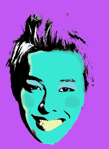
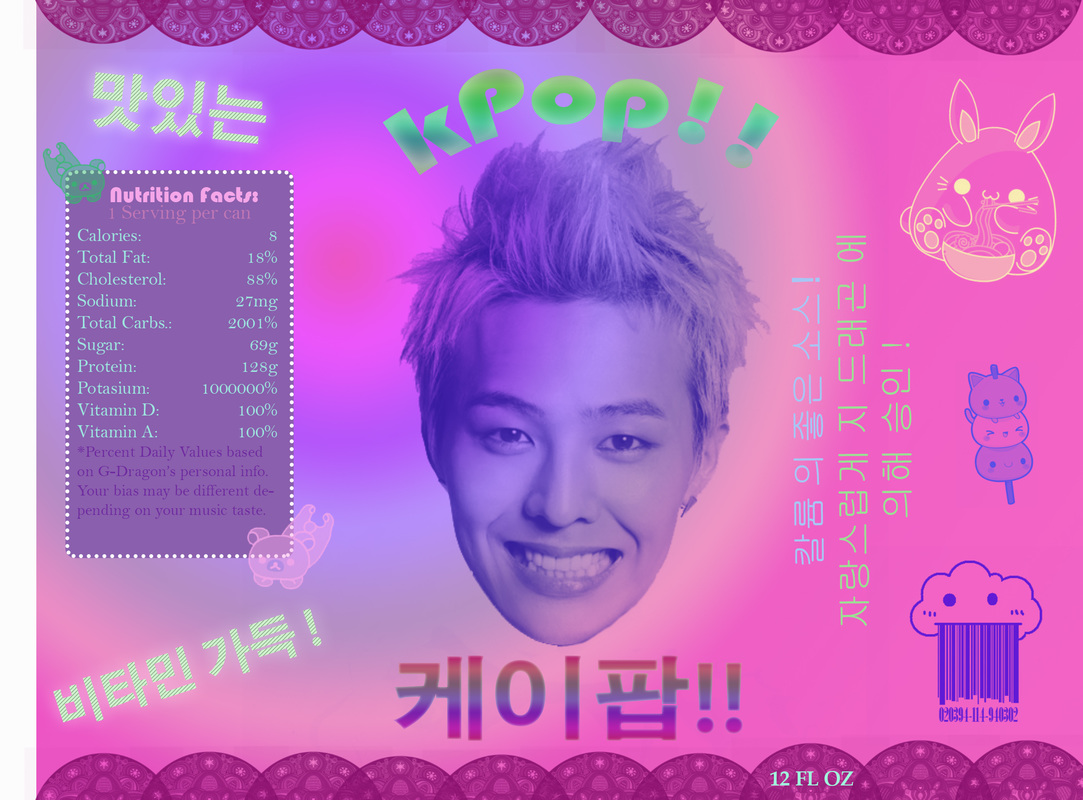
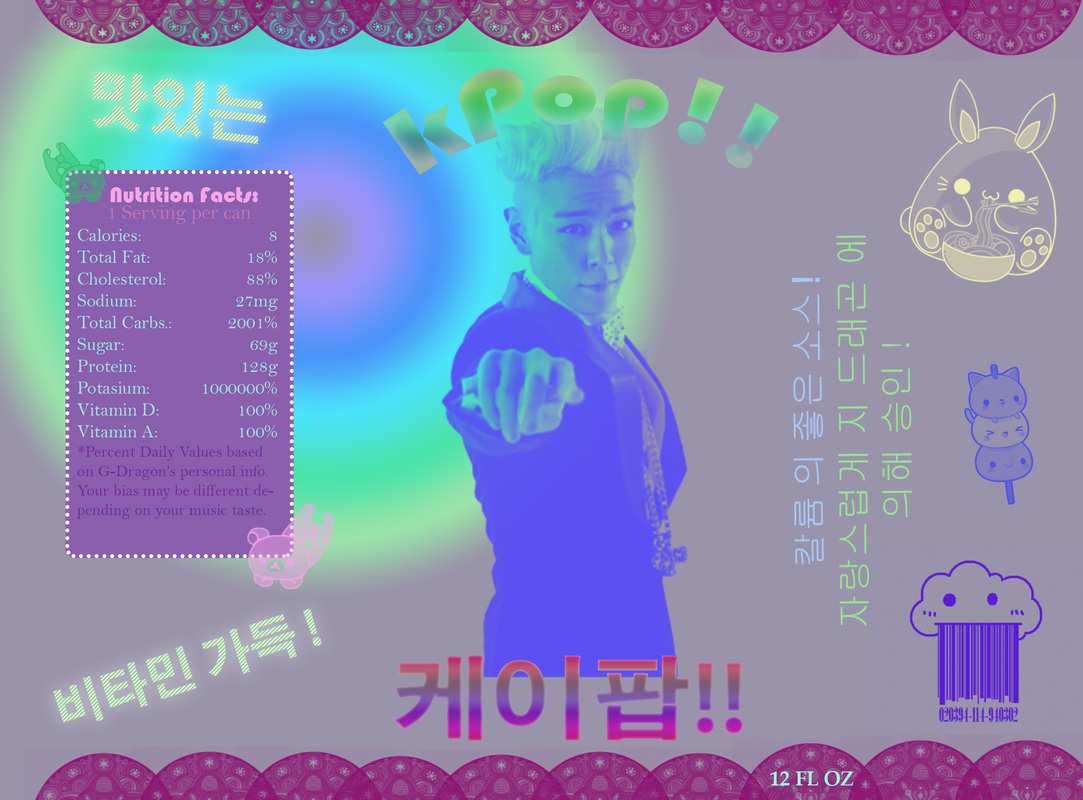
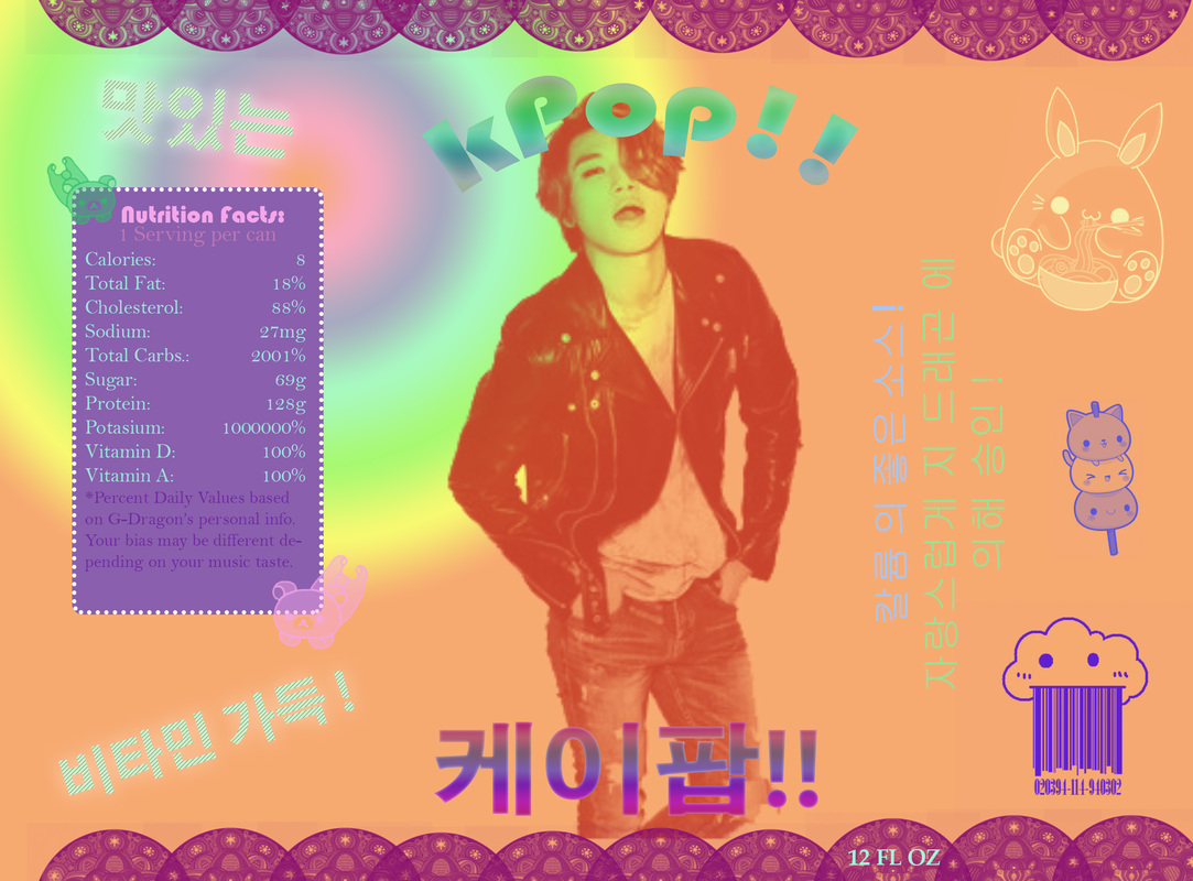
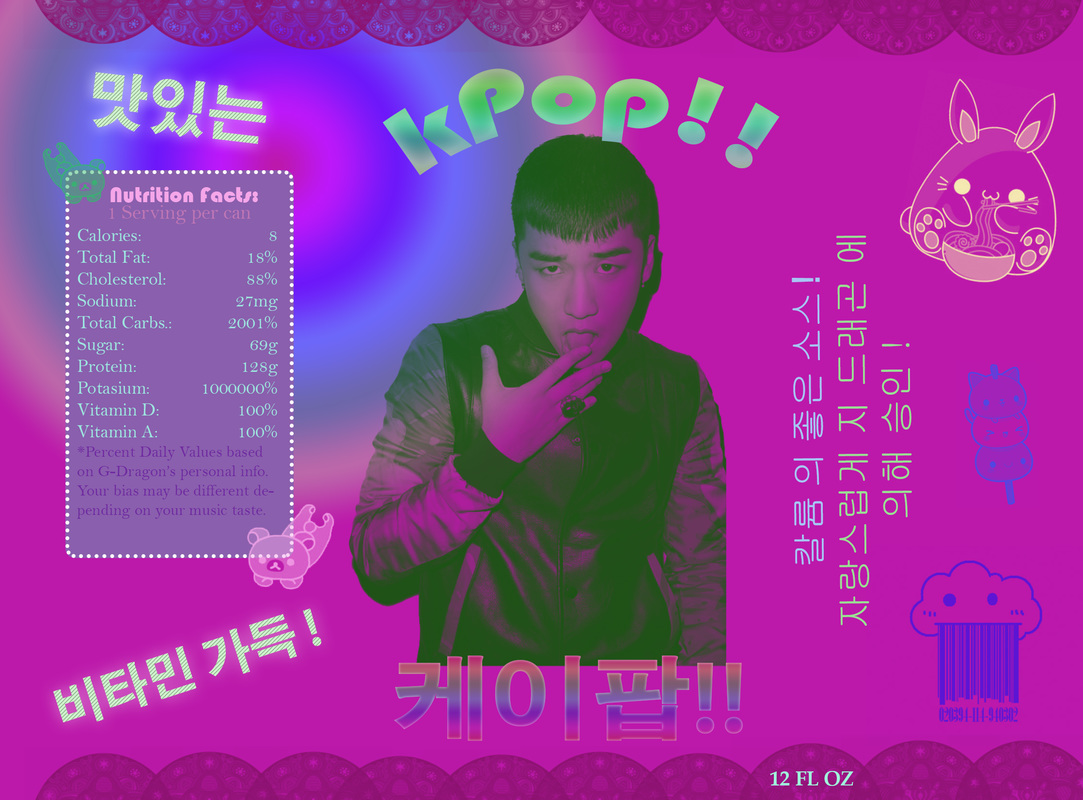
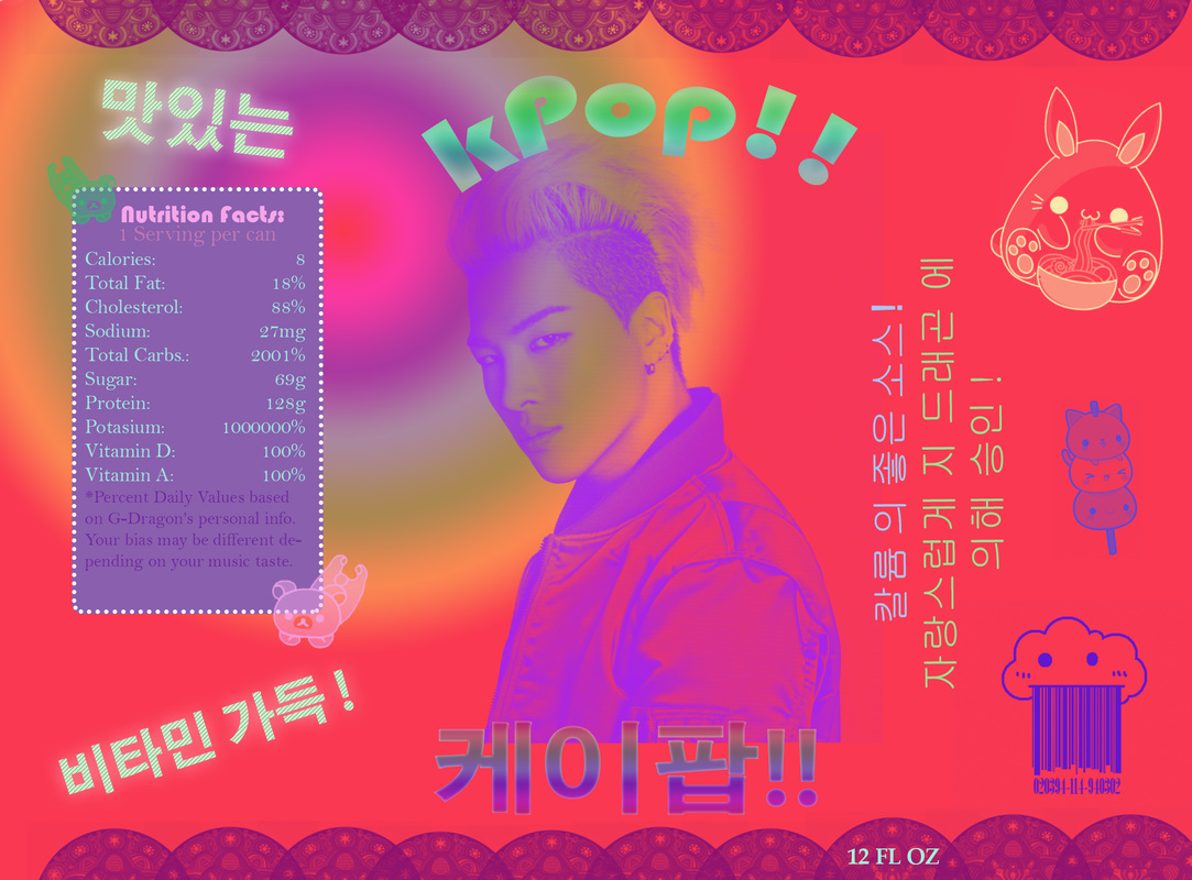
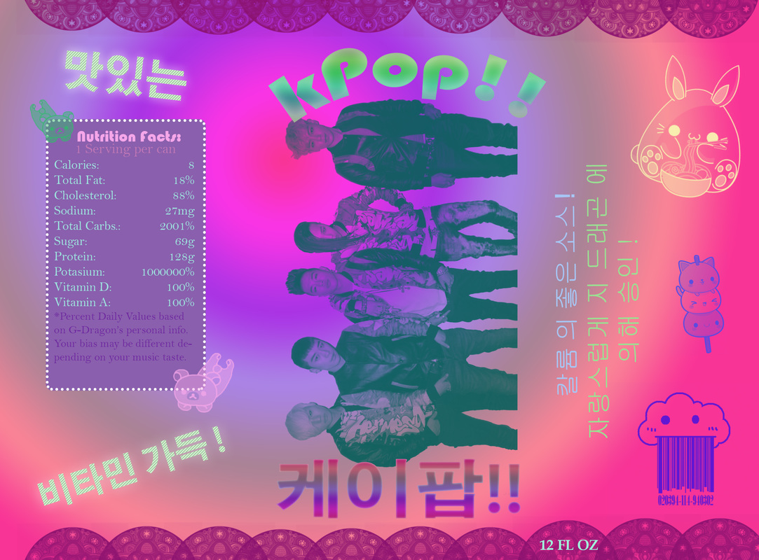
For this project I used the same G-Dragon face I used for my kPop label. I chose this image because the head shot was so straight on that it made selecting and isolating his facial features easy. I have always loved Andy Warhol's art, so I wanted to pay homage to him through this piece. I wanted to be a little bold with my color choices and put paint in places that weren't necessarily expected. If I could do this project again, I would have found a different tutorial to watch because the one I used really confused me!
This week we had a the theme transparent. I have always loved surreal photography, so I decided to create some of my own! I intended to erase my body and have the background be visible instead, but realized once I was at school that I didn't have a blank background to work with. Instead, I decided to mess around with the blur and smudge tools. As you can tell, the two photos were handled with a slightly different technique. In the first one, I blurred, smudged, and erased my exposed body to create a sort of black ghost form. After all of that, I also added a motion blur filter on top of the whole photo so the transitions would be more believable. I started the second photo intending to make it exactly like the first, but then ended up really loving having my body just blurred. I like how the second picture looks blatantly fake, I think that add to the creepy feel. If I had the chance to do this project again, I would have stuck to the original plan and made sure to take a back ground picture.
As a hardcore pasta lover, I decided to base my village off of pasta sauce ingredients. I could see chipmunks living here because they are small and very cute. The fantastical colors would accentuate the cutsie feel, which I really wanted. I also have a love for warped perceptions of reality, so that is why I made everything but the tomato colors that could not feasibly occur in nature in that context. I wanted to blend the edges of the doors and ingredients to make them look less applied, but I couldn't get the eraser to look how I wanted. I just figured I would let the piece be what it was without the blending because I still think it looks good. Also I think more experience with the warp tool and a better understanding of the curves of my objects would have helped me more accurately form the doors to the garlic and tomato.With this cinemagraph, I animated my friend vaping. Though the normal approach would be to animate the smoke, I wanted to something unexpected and animate him instead. I picked him and his vape to be my subject because I have a particular love for smoke and the way it forms in the air. For once I don't really have a deep meaning to my work, it was just a concept I thought would be interesting to test out. For my object in movement, I chose to use the Marvel bobble heads attached to my dashboard. I picked these objects because they were easily accessible and had a very interesting kind of movement. Again, there wasn't any deep meaning to this gif, but I do have a love for Marvel, especially Thor. The hardest part about this project is perfecting the mask so the gif looks purpose. As you can probably tell, both of mine are just a little off. If I had to give advice to a future student about this project, I would advise them to take more time getting the erasing as exact as possible when creating a hole in the mask.
For my project, I chose to use two furry creatures: a munchkin cat and a bush baby! I chose these two animals because I love their unique and distinct features and wanted to see what they would look like combined. Enjoy!When I was first introduced to this project, I had no clue what I was going to do. All I knew was that I had a whole can to cover. Then it occurred to me that I could use a pun to make the perfect product: kPop. This product is a soda (get it? soda pop?) that is based entirely off of my bias kpop group, BIGBANG. All of the nutrition facts are based off of my ultimate bias, G-Dragon. The nutrition information stays the same for every can, but I made a special edition flavor for each member of the group. Everyone has their own individual label, and then there is a group shot thrown in to make it an even six pack. I chose to execute my project this way because I am really into kpop and Korean culture currently, so I have a lot of passion and enthusiasm for it. This is the first project that I can honestly say I wouldn't change a thing about if I were to do it again. The hardest part was getting the gradient where I wanted it to be and finding a picture that I could easily cut into a brush.
|
AuthorBeginning computer animator and artist. Archives
January 2016
Categories |